One of the most common phrases often heard from clients is “We want a website design just like Apple’s.” It always pops up during client feedback and design meetings. Apple’s website is known for its beautiful designs and excellent user interfaces. One of its amazing features is its elegant website design.
One of the reasons behind its successful website design is that it is created around a user and visually awe its visitors. Most importantly, they achieve this aesthetic appeal without compromising the user experience. Thus, Apple has struck a perfect balance between UI and UX.
Simple Tips to Design a Website Like Apple
Do you want a website design like Apple? If yes, then we have got you covered. Here are the top recommended tips and lessons to learn from the official website of Apple. You can integrate these tips to create a stylish site like Apple.
1). Simple Design is the Key!
One of the most common problems a lot of businesses commit is trying to fit as much content as possible in a small area! This way, one single homepage ends up getting cramped with multiple graphics, videos, customer testimonials, statistics, and much more.
Visual design is the key concept in Apple’s website design. It incorporates several elements like grid layouts, use of fonts and colors, comparisons, contrast, transparency, etc., using multiple HTML elements. Clean web design tends to manage a large amount of content in an elegant way.
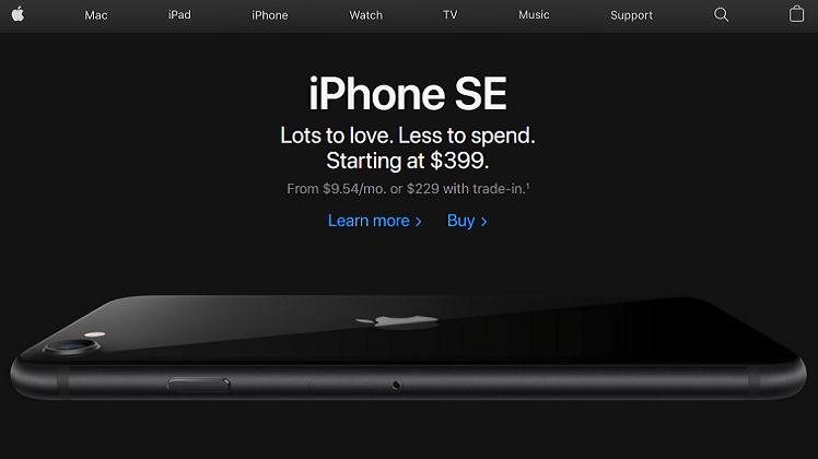
Apple manages to achieve this clarity by smart use of white space and using simple white/black backgrounds. The website also has a minimal color palette with simple typefaces, making it look organized and chic.
Despite the number of its products and services, Apple has designed a simple website with a hierarchy of information. Apple features a top navigation bar with product choices and categories in the form of clean icons. One of the most remarkable features is that its navigation bar has no drop-down feature like all other websites. Therefore, users can easily navigate through the website.
With clear navigation, Apple ensures that its users can find information quickly. Apple quickly capitalized on the fact that people don’t like being overwhelmed with excessive information. They created a landing page that is elegant, sharp, and above all, simple and free of excessive information. The landing page is the key to an excellent website.
3). High-Quality Graphics
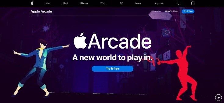
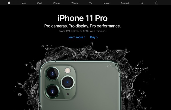
Good quality photos and graphics are a complete game-changer when it comes to web design. Beautiful web design with clear navigation and a clean layout can be undercut by low-quality images and animations. If you look at Apple’s website, you see that they have used fewer photos, but everyone is extremely high.
This above picture is an example from Apple’s Arcade. The page uses a high definition video with enticing graphics and animations. Thus, a cardinal rule in website design is to use some high-quality images that feature your products and brand. Avoid using dated stock photos from the internet, but use brand-specific graphics just like Apple’s Arcade.
4). Brand Consistency
Another most prominent feature of the Apple website is its consistency in design and branding. One must remember that consistency is the key to a successful website. Would you like the Apple website if it had different fonts and colors on each page? No one would!
Managing a website with a lot of information and content like Apple requires a detailed style guide and making sure no design element clashes with another. Apple has a large site, with various products ranging from iPhone, Mac, iPad, etc. Every single page has a uniform layout that speaks for the brand itself.
5). Get a Professional Website Architect
One of the key elements of a successful website is to make sure it is strong enough to handle heavy traffic and unforeseen issues or Google updates. Therefore, you must consult with website design Dubai based companies who are comfortable working with JavaScript, HTML, CSS, and more. For an Apple inspires website, CSS is a vital element that holds all the HTML tags together.
HTML is necessary for determining how different elements on the website appear, including text, color, hyperlinks, graphics, fonts, etc. Thus, you need professional help to develop a platform that can host a successful website that is visually appealing and highly interactive.
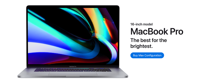
If you want image transitions like scrolling across the image of MacBook as it opens up, then you need JavaScript to design a dynamic website.
Make your Website Look Like Apple!
If you want your business to be the next big thing in the market, then start designing your website. While you may not yet have brand popularity like Apple, it doesn’t mean you cannot build a website that wows everyone and looks like a million dollars!
When it comes to web design, never settle for something less than perfect, or something that screams “amateur!” So, follow these tips and get professional help to design a website that is on par with Apple and all the big brands!
Learn More:
Essentials of a Good Web Push Notification Strategy
All You Need To Know About SEO Link Building
Best Practices to Optimize Images for Visual Search
A Brief Guide to Website Structure and Its Types


